
Hi,
This is just a very minor thing. ;-)
I am using the 'Glitter - night'-layout.
When I look in the download at the History-tab, the 'clear all'-button (garbage can) is on the bottom right. When I look at the Waning-tab, the 'clear all'-button (the cross) is on top right. Can they please be both on the same spot?
Move the 'clear all'-button in warnings


Re: Move the 'clear all'-button in warnings
You're right that History/Queue/Warnings are not consistent in placement of certain buttons.
In the end I just choose my personal preference for a clean interface at the cost of consistency
In the end I just choose my personal preference for a clean interface at the cost of consistency
If you like our support, check our special newsserver deal or donate at: https://sabnzbd.org/donate
Re: Move the 'clear all'-button in warnings
Haha, ok, point taken 
Re: Move the 'clear all'-button in warnings
Maybe you can make a screenshot of what would be better placement? Always up for improvements.
If you like our support, check our special newsserver deal or donate at: https://sabnzbd.org/donate
Re: Move the 'clear all'-button in warnings
I really like the spot right above where this cross is:
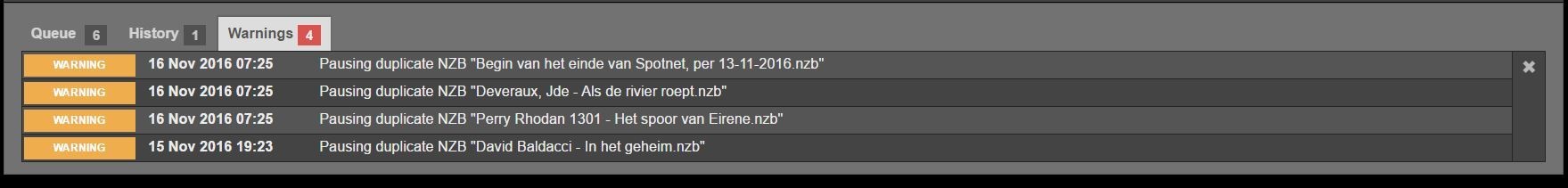
Just the same spot on all tabs.
Not this:

Just the same spot on all tabs.
Not this: