Move the 'clear all'-button in warnings
Posted: November 16th, 2016, 1:36 am
Hi,
This is just a very minor thing. ;-)
I am using the 'Glitter - night'-layout.
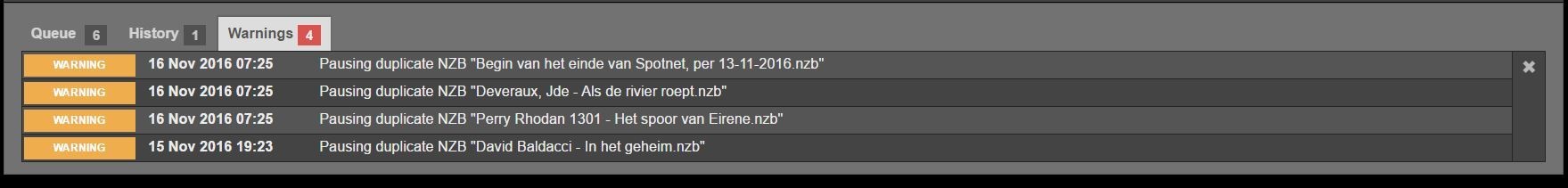
When I look in the download at the History-tab, the 'clear all'-button (garbage can) is on the bottom right. When I look at the Waning-tab, the 'clear all'-button (the cross) is on top right. Can they please be both on the same spot?
This is just a very minor thing. ;-)
I am using the 'Glitter - night'-layout.
When I look in the download at the History-tab, the 'clear all'-button (garbage can) is on the bottom right. When I look at the Waning-tab, the 'clear all'-button (the cross) is on top right. Can they please be both on the same spot?